Moments Social Activity App
Moments was created from a simple insight: people want to be more social and explore local activities, but often don’t know where to start. Community events are usually scattered across closed groups or word of mouth, making it hard to discover what’s happening nearby. As the lead designer, I worked across all phases—from early research to MVP launch and iterations. This included user interviews, usability testing, UI design, and refining onboarding through data insights.
Role
Lead designer
Employer
Lemon App
iOS, Android
Platform
Areas
UX/UI Design
Background
Moments was born during the pandemic, a time when many experienced isolation and struggled to reconnect socially. We saw a clear need for a simple, low-barrier way to find or host activities and meet new people. The app aims to solve this by offering one open, low-barrier platform to find or host activities and connect with others. After launching our MVP, we’re now in the early stages of understanding user behavior, identifying friction points, and iterating based on real-world feedback. The focus is on uncovering what users truly need and designing for that.
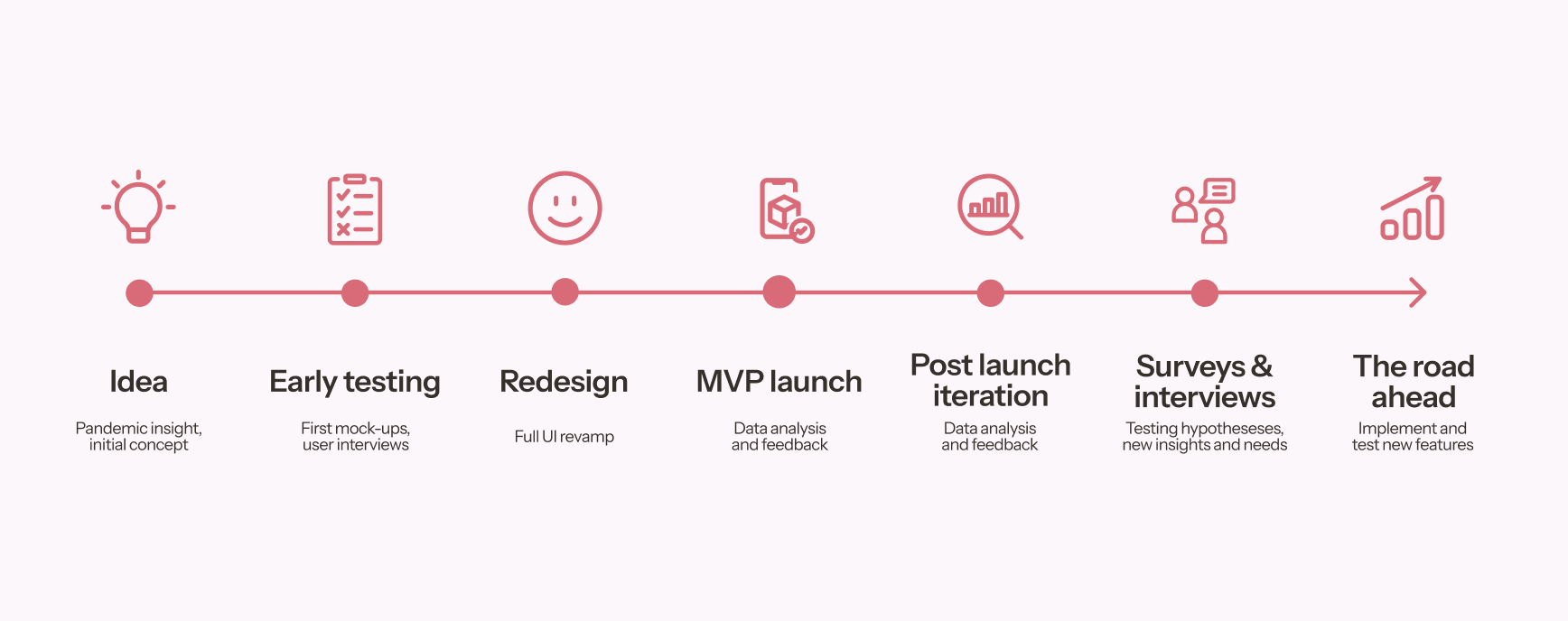
Product development timeline
Post-launch iterations
After launch, we found that partnerships with established communities drove strong engagement and positive feedback. At the same time, we saw a high drop-off rate during registration, which made it clear we needed to rethink the flow. We removed unnecessary steps, split each step into its own screen for a more seamless experience, and focused on making the process feel safer by avoiding requests for sensitive data.
We also implemented new tag features to make the process feel more engaging. Tags allow users to share more about their interests and activities in their profile, and will eventually be used to connect them with the right people, communities and activities through improved matching. These changes also addressed user feedback requesting more information on profiles.
First version of onboarding
Latest version of onboarding featuring interest and. personality tags.
Surveys and interviews
With over 400 registered users, a lot of positive feedback, and strong turnout for activities hosted by partners like Nordic Flow and runners groups, we still saw low activity levels within the app itself.
To understand why, we developed a set of hypotheses and designed a user survey followed by in-depth interviews. The goal was to uncover potential gaps, friction points, and improvement opportunities to strengthen the overall user experience.
Based on these insights, we are now focusing on:
Community-first approach – Creating dedicated groups (e.g. "Jenter Oslo 20–35") where users can connect more naturally before activities are planned.
Diversifying activities – Expanding beyond running events to include wellness and creative activities, addressing the lack of content.
Flexible coordination – Introducing group features like polls and chat to coordinate dates and times more easily.
Iterative testing – Validating these changes through ongoing usability tests and feedback loops to ensure improved conversion and engagement.
From the start, I wanted to set up a scalable design foundation that would support the team long term. I created a set of reusable components in Figma using auto layout and variants. This made it easy to maintain consistency and move fast as we iterated on insights from user research.


